
You are currently browsing the category archive for the ‘emotions’ category.
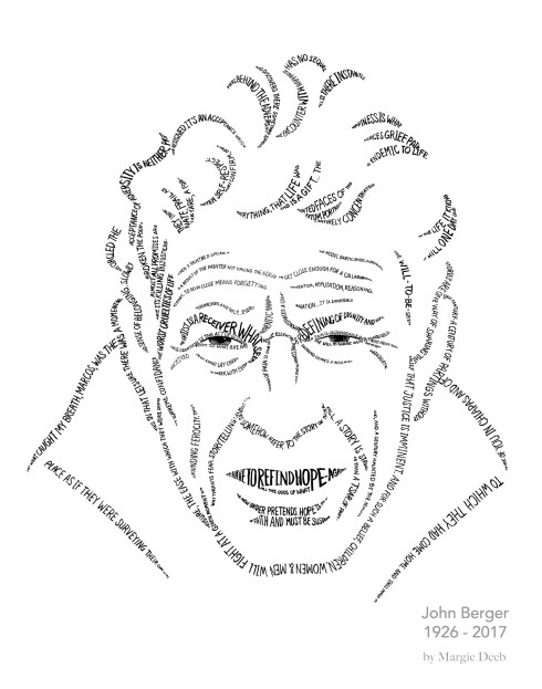
John Berger was able to see through the apparent to deeper, more meaningful levels of truth. He did this as writer, philosopher, artist, and humanist. His words and ideas give me hope and direction.
An extraordinarily kind man, Berger’s writing seeks to understand through compassion those he writes about, whether it be Frida Kahlo’s pain, the despair that motivates a terrorist, or the hope of people in poverty.
In this hand drawn tribute, my calligraphic lines (from a photo by Jean Mohr) depict John’s face and become the containers for his words. I selected words from several of his essays that resonate with me.
Beneath this portrait are shots of the work in process.
Thank you, John, for helping me to see.


I’m writing to you about fiction again, not design, color, or jewelry. I’ll get back to those passions next week, because I will have exciting news to tell you (especially those of you who have been wanting to take classes from me, but can’t because I’m here and you’re there and I never get there). More on that next week.
Today I’d like to share another excerpt from one of the flash fiction stories I contributed to the fiction and poetry compilation, Mosaic. One of the things I find most beautiful in life is hope: hope that in the dark becomes a beacon of light; hope that people who have suffered great loss hold, even as their backs are bent in grief. This story is one of hope. Its title is “Connecting Flight.”
 “I’m at the gate waiting to board Zone 3. Three years ago I would’ve been thrilled to be going home. Three years ago Sarah would’ve been there waiting for me. I instinctively rub my left thumb against the ring I cannot – will not – take off. That was a long three years ago.
…
Out of the corner of my eye I see jerky movements. I turn and pretend to look through the window at the plane we’re about to board, but I’m really trying to see what’s going on. She’s very old. In a wheelchair. Bright pink shirt. Her claw-like hands rhythmically clutch and release a purse. Her head trembles. God, I hope I’m not sitting next to her. I hate myself a little for thinking that, but why should I? I just want a quiet flight. Old women always want to talk.
Once I’m in my seat, who do you think the flight attendant helps into the aisle seat next to me? Of course.”
To read more download Mosaic for free.
Please leave a review for us. Two of you, dear readers, left a review (or wrote to me of your intention to). Writing a review can be intimidating, and it takes time and energy. I deeply appreciate your generosity.
A review on Amazon for my book, The Beader’s Guide to Jewelry Design, touches me deeply. Alicia wrote:
“What I didn’t expect was the paragraph at the end where the author emphasized that as beaders we’re allowed to think that what we create is important.
…we’re allowed to be passionate about our own creativity. It gave me chills. It brought tears to my eyes. It was an enormous relief, because for years I’ve been unknowingly downplaying my own love of beads and beadwork. I’ve been playing it off as a mere hobby, keeping quiet about it, pretending it’s a shameful secret that nobody really needs to know about, instead of a vital part of my creative life and an increasingly important part of who I am.
I think I needed to hear that even more than I needed help with color values, to be honest.”
I wrote last week’s blog post/newsletter, An Act of Love with Alicia’s words in mind.
 Decades ago a collection of my beaded jewelry was featured in a gallery opening. I didn’t tell anyone about it because I thought it wasn’t important. It’s just jewelry, made out of glass beads, and after all, I made it, so how important could it be? If I’d been showing paintings, now that would have been important.
I was raised amid the mind set of artistic chauvinism, believing that creating in one medium was superior to another. It’s a common snobbery that was even more prevalent pre-internet. It did damage. Someone else – someone unnamed, ambiguous, and anonymous – had the power to determine if what I created measured up, not me. And I came to believe that what I created would never measure up, no matter the medium. What a price to pay! It’s taken years of conscious effort, contemplation, and healing to unlearn that garbage and learn to value and honor creativity more than the medium, more than the creation itself.
What is important is that we create.
Whether we use glass beads, paint, words, sound, fabric, or macaroni elbows is of little importance.
What is important for me is that when I’m creating I am connecting with my Soul. I’m giving to myself and to others. I’m inspiring others to create and seek and connect.
I’m honored by Alicia’s words. She inspires me and reminds me how much creativity, my creativity, matters.
I’m interested in hearing your thoughts. Why is creativity important to you?
Thank you,
Margie
Want to see knock-your-socks-off extraordinary creativity in every medium imaginable? Check out one of my favorite Pinterest boards, Soaring Creativity
 Maybe like me, you grew up among the notion that jewelry is, at best, gewgaw for the shallow minded. Or, at worst, a prop for the vain. That jewelry is no more than playing dress up; meaningless in the grand scheme of things.
Decades ago I worried that I was devoting a large part of my life to a frivolous pursuit that, in the end, would prove it misspent or squandered. But now, after having explored every aspect of jewelry from the ornamental, to the academic, to the aesthetic, and to the most fascinating for me, the psychological and emotional, I’ve come to a secure peace in knowing this: I have devoted much of my passion to precisely the right thing for me and my growth.
An excerpt from The Beader’s Guide to Jewelry Design speaks to what I’ve discovered.
“We diminish the significance of jewelry – and its creation – when we consider it simply ornamentation. The very heart of jewelry is the expression of being. Each time we make and adorn ourselves with jewelry we give ourselves over to an ancient ritual, a ceremony where the alchemy of our creativity combines with the passion of our self-expression.
The result? Magic.”
An alchemical magic happens when we commit a deliberate act of love and beauty.
Before I design jewelry for a friend I spend considerate time imagining. My mind sweeps through years of scenes. I see her laughing, talking, turning her head. I mentally sort through what I know she finds beautiful in books, movies, relationships, nature, art. I sense who she is beyond words. Like sculpting clay, I form these sensations into an object of beauty. She will drape this beauty on her Self, and it will temporarily become part of who she is.
Beyond artistry, talent, and skill, this is an act of love.
When we make (or choose) jewelry for ourselves, the process is more intuitive and rapid. But it is no less than – nor should it be – an act of love. And when a woman loves herself it has a profound impact on this world. This world where many women are raised to hate their bodies, hate themselves, see themselves as less-than, put their wants, desires, and needs beneath those of others.
Creating, choosing, and wearing jewelry can be an act of love that can have a profound impact on the world. It will start imperceptibly small: You may not be aware of it. But it can touch each person you interact with. And from there, expand infinitely.
Now when I hear the notion that jewelry is a fribble of vanity I smile. We jewelry designers know the truth, even if we’ve not put words to it, even if we’re not fully conscious of it. We know the necklace itself is a symbol, a reflection of the love and beauty that went into creating or choosing it. And we know the life-affirming power we feel when we suffuse our lives and ourselves with love and beauty.
by Margie Deeb
excerpt from Margie’s Muse, September 2010
excerpt from Margie’s Muse, September 2010
 I’m often asked how to use the colorwheel. That question takes considerable time to answer (it took me four years and 144 pages to answer to it thoroughly in The Beader’s Guide to Color). But it’s a question that deserves an answer short enough to introduce you to the most valuable color tool I know.
I now have a shorter answer for you: the Instant Color Wheel Guide, a PDF download for $3.95. I’ve designed this digital publication so that in 10 minutes or less you’ll understand the basics of using the color wheel, and you’ll no longer be confused or intimidated by it. It’s easy to understand, and full of examples.

Let’s me tell you about my approach to using color. Then we’ll explore one of my favorite color schemes using some of the material from the Instant Color Wheel Guide.
Before I make any color decisions I always ask myself (and answer myself) these kinds of questions:
What impact do I want my finished color scheme to have?
How do I want the viewer to feel when they see it?
What am I trying to convey?
The color scheme you choose to work with will depend on the answers to these most critical questions. The descriptive words at the top of each page of the guide will help you answer the questions; they give a broad view of nature of the color scheme.
For example, let’s say you want a color scheme that is evocative, poetic, harmonious, and easy to work with. That fits the description of the analogous color scheme. Let’s look at it…
Highpoints of analogous color schemes:
- 2 or more colors adjacent to each other on the wheel (including pure hues, shades, and tints)
- they create gentle movement because the colors are similar
- they are temperature specific, leaning toward warm or cool
- to maintain the overall mood use no more than 4 analogous colors
Because of their proximity, adjacent colors are intrinsically harmonious, making them easy to combine successfully.
Analogous schemes fill our world: the iridescence of peacock feathers, the changing blues and greens under the ocean, and the yellow-to-pink gradations of a lotus blossom.
The analogous palette has a mellifluous quality. Its colors swirl and flow into one another, defying boundaries. Where does blue end and blue-green begin? The analogous palette seeks no answer. It just revels in the mystery of movement.

"Golden Earring" from Beading Her Image
Excerpt from Margie’s Muse, April 2010
I am and always have been fascinated with faces. I have a library full of portrait photography books, just to study faces. I draw them on a weekly, if not daily, basis. I photograph them. (I wish I could ask more strangers if I can photograph them, but the few times I have, it frightens folks… so I stick to people I know.) I go to the movies in hopes of big screen close ups… giant faces. I’m thrilled when they are so big I can see the pores! Women, men, any race, any color, any age (the older the more intriguing)… it doesn’t matter… I love faces.
I draw and paint so many faces that people tend to label this preoccupation as portrait painting. But I’m not a portrait painter. I am not as interested in who I am painting as I am the expressions and the feeling that the face conveys. I prefer depicting faces of people I don’t know so I don’t get caught up in trying to create a realistic portrait. And I don’t use flesh tones or realistic colors.
I consider my depictions of faces “landscapes of the Soul,” not portraits.

"Iris" from the book Beading Her Image
It is the Soul I am seeking. The Soul beyond the face.
A painting hangs on our meditation room wall. Its my favorite of all I have painted so far. When I sit quietly and look at it and let it look at me, I sense myself standing taller. I feel a surge of being filled with more power than I am aware of throughout my day. I look at Her face and realize “This is who I want to be. Everything I sense in this face is where I am headed.”
These are the kinds of feelings and thoughts I want my landscapes of the Soul to inspire in viewers. I want them to instill a sense of more in each viewer: “There is more than this I see right now. I can be more. I can want more. I am more than who I think I am.”
I chose to create Beading Her Image for two reasons: to unabashedly indulge myself in the study of more faces. And to honor the sacred of women: those innate qualities that women have (and often deny) of power, charm, compassion, and beauty (not the magazine kind).
Beading Her Image has been out 5 years now, and is not slowing in popularity.
My hope is that the beaded landscapes of the Soul in the book fill you with more of your own beauty.
To see all the accompanying photos and close ups for this article, download the Margie’s Muse PDF version.
[Beading Her Image is on sale 25% off through April 30, 2010]


“The Glamour” from the technique and pattern book Beading Her Image by Margie Deeb which features patterns for peyote, brick, and square stitch, and loomwork. Design by Margie Deeb. Loomwork by Frieda Bates.
This is an excerpt from my June 2009 Margie’s Muse column. Read it in its entirety here.
In the January 2009 Margie’s Muse Making Your Monochromatic Magnificent, we focused on how to make strong monochromatic color schemes. Let’s turn our attention to them again, this time honing in on their most powerful ability: that of evoking emotion.
What thrills me most about color is its emotional impact. One color lifts my mood and energizes me, another flames my passion, while another reminds me of who I really am, speaking to my heart in ways no words can. Experiencing this mystical power is color’s magical spell. And I’ve been spellbound my entire life.
Because they feature one color, monochromatic schemes express emotions associated with that color and are psychologically powerful. They are strong communicators of mood, eliciting palpable reactions. If blue is your choice, your piece will speak either of peaceful reflection or of melancholy, depending on how you deal with the color properties.
Let’s look at two monochromatic seed bead patterns I designed for my book, Beading Her Image. (The book contains the peyote, loom, brick, and square stitch versions of the patterns.) In “The Glamour” (above), varies values and bead finishes of pinkish coral are combined to create a sensual, feminine impression.
Now, look what happens (below) when the main color is changed. The piece elicits a totally different emotional reaction. The sensuality that the soft pinkish-corals evoked is gone, replaced by emotions the other colors bring forth. What do you they make you feel?


Read the rest of “Shift the Color, Shift the Mood” in the PDF version of the June 2009 Margie’s Muse at http://www.MargieDeeb.com
