
You are currently browsing the category archive for the ‘Artistry’ category.
John Berger was able to see through the apparent to deeper, more meaningful levels of truth. He did this as writer, philosopher, artist, and humanist. His words and ideas give me hope and direction.
An extraordinarily kind man, Berger’s writing seeks to understand through compassion those he writes about, whether it be Frida Kahlo’s pain, the despair that motivates a terrorist, or the hope of people in poverty.
In this hand drawn tribute, my calligraphic lines (from a photo by Jean Mohr) depict John’s face and become the containers for his words. I selected words from several of his essays that resonate with me.
Beneath this portrait are shots of the work in process.
Thank you, John, for helping me to see.


A review on Amazon for my book, The Beader’s Guide to Jewelry Design, touches me deeply. Alicia wrote:
“What I didn’t expect was the paragraph at the end where the author emphasized that as beaders we’re allowed to think that what we create is important.
…we’re allowed to be passionate about our own creativity. It gave me chills. It brought tears to my eyes. It was an enormous relief, because for years I’ve been unknowingly downplaying my own love of beads and beadwork. I’ve been playing it off as a mere hobby, keeping quiet about it, pretending it’s a shameful secret that nobody really needs to know about, instead of a vital part of my creative life and an increasingly important part of who I am.
I think I needed to hear that even more than I needed help with color values, to be honest.”
I wrote last week’s blog post/newsletter, An Act of Love with Alicia’s words in mind.
 Decades ago a collection of my beaded jewelry was featured in a gallery opening. I didn’t tell anyone about it because I thought it wasn’t important. It’s just jewelry, made out of glass beads, and after all, I made it, so how important could it be? If I’d been showing paintings, now that would have been important.
I was raised amid the mind set of artistic chauvinism, believing that creating in one medium was superior to another. It’s a common snobbery that was even more prevalent pre-internet. It did damage. Someone else – someone unnamed, ambiguous, and anonymous – had the power to determine if what I created measured up, not me. And I came to believe that what I created would never measure up, no matter the medium. What a price to pay! It’s taken years of conscious effort, contemplation, and healing to unlearn that garbage and learn to value and honor creativity more than the medium, more than the creation itself.
What is important is that we create.
Whether we use glass beads, paint, words, sound, fabric, or macaroni elbows is of little importance.
What is important for me is that when I’m creating I am connecting with my Soul. I’m giving to myself and to others. I’m inspiring others to create and seek and connect.
I’m honored by Alicia’s words. She inspires me and reminds me how much creativity, my creativity, matters.
I’m interested in hearing your thoughts. Why is creativity important to you?
Thank you,
Margie
Want to see knock-your-socks-off extraordinary creativity in every medium imaginable? Check out one of my favorite Pinterest boards, Soaring Creativity
 Maybe like me, you grew up among the notion that jewelry is, at best, gewgaw for the shallow minded. Or, at worst, a prop for the vain. That jewelry is no more than playing dress up; meaningless in the grand scheme of things.
Decades ago I worried that I was devoting a large part of my life to a frivolous pursuit that, in the end, would prove it misspent or squandered. But now, after having explored every aspect of jewelry from the ornamental, to the academic, to the aesthetic, and to the most fascinating for me, the psychological and emotional, I’ve come to a secure peace in knowing this: I have devoted much of my passion to precisely the right thing for me and my growth.
An excerpt from The Beader’s Guide to Jewelry Design speaks to what I’ve discovered.
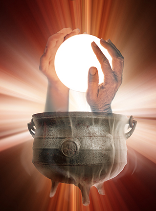
“We diminish the significance of jewelry – and its creation – when we consider it simply ornamentation. The very heart of jewelry is the expression of being. Each time we make and adorn ourselves with jewelry we give ourselves over to an ancient ritual, a ceremony where the alchemy of our creativity combines with the passion of our self-expression.
The result? Magic.”
An alchemical magic happens when we commit a deliberate act of love and beauty.
Before I design jewelry for a friend I spend considerate time imagining. My mind sweeps through years of scenes. I see her laughing, talking, turning her head. I mentally sort through what I know she finds beautiful in books, movies, relationships, nature, art. I sense who she is beyond words. Like sculpting clay, I form these sensations into an object of beauty. She will drape this beauty on her Self, and it will temporarily become part of who she is.
Beyond artistry, talent, and skill, this is an act of love.
When we make (or choose) jewelry for ourselves, the process is more intuitive and rapid. But it is no less than – nor should it be – an act of love. And when a woman loves herself it has a profound impact on this world. This world where many women are raised to hate their bodies, hate themselves, see themselves as less-than, put their wants, desires, and needs beneath those of others.
Creating, choosing, and wearing jewelry can be an act of love that can have a profound impact on the world. It will start imperceptibly small: You may not be aware of it. But it can touch each person you interact with. And from there, expand infinitely.
Now when I hear the notion that jewelry is a fribble of vanity I smile. We jewelry designers know the truth, even if we’ve not put words to it, even if we’re not fully conscious of it. We know the necklace itself is a symbol, a reflection of the love and beauty that went into creating or choosing it. And we know the life-affirming power we feel when we suffuse our lives and ourselves with love and beauty.
The following is an excerpt from my May 2012 Margie’s Muse column. Download and read it in full.

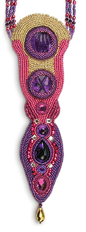
Fifty colors of complex patterns and harmonies rotate around “Genevieve’s Hat” by Anne Hawley. Your eye is drawn in and around, led by the colorful rhythms. An assemblage of sead and semi-precious beads, and Swarovski crystal in flat round peyote stitch on suede lining.
What makes a well designed piece of beadwork? How do you create a unified, harmonious piece so completely balanced and whole that nothing added or taken away would improve it? Pattern is one way.
Because they transmit visual rhythm, patterns can invigorate your jewelry design with movement. That movement can make a design hum, sing, or belt out loud.
Surface pattern is inherent in seed bead weaving. The locking together of the beads and the minute spaces between them sets up predictable geometric patterns.
Pattern is created by repetition. Like a tour guide, it invites you in, and shows you around.
In a well-planned pattern, the eye travels, following points of interest. These points may be the brightest (or darkest) colors, or the largest expanses of color. They may be directional shapes and elements, like lines or arrows. In fact, any element that stands out from its surroundings becomes a point of interest, or focal point….
 I’m working on my 5th book and I want you to be my co-author, so that The Beader’s Guide to Jewelry Design gives you exactly what you want and need.
The Plan
From now through June 2012 I’ll be asking you questions, seeking your advice and feedback, and requesting examples from you. I’ll be chronicling our progress. If you respond, you, your words, or your jewelry may be in the pages of the book (with your permission). You will be acknowledged for your contribution.
I’ll do this through this my Facebook Artist Page: http://www.facebook.com/margiedeebpage
If you want to be a part of this adventure, please subscribe so you won’t miss any of my requests.
About The Book
The Beader’s Guide to Jewelry Design is not a technique, construction, or project book. Rather, it will teach both seasoned professionals and beginners how to design, or improve their design. It will demonstrate design concepts and principles and show you how to apply them. It will explain the aesthetics of function, form, and wearability. Ultimately, it will inspire you to create, grow, and creatively express more of yourself.
OK, Here’s Where You Come In
The First Question: What problems do you face when designing jewelry?
To get your mind working, here are more leading questions:
Are you challenged by shape or composition?
Does color baffle you?
Is making focal points within a piece difficult?
Do you know how to lead the viewer’s eyes around and within a piece?
Do you have trouble making a piece look unified?
Do you have problems with your work looking boring or lifeless?
Not sure where to begin when trying to design?
Stumped as to how to take your design skills from solid to spectacular?
Please keep your answers brief. You can respond at http://www.facebook.com/margiedeebpage, or Email your answers to: design@margiedeeb.com
Thank you! I’m so excited about our journey together!
by Margie Deeb
excerpt from Margie’s Muse, September 2010
excerpt from Margie’s Muse, September 2010
 I’m often asked how to use the colorwheel. That question takes considerable time to answer (it took me four years and 144 pages to answer to it thoroughly in The Beader’s Guide to Color). But it’s a question that deserves an answer short enough to introduce you to the most valuable color tool I know.
I now have a shorter answer for you: the Instant Color Wheel Guide, a PDF download for $3.95. I’ve designed this digital publication so that in 10 minutes or less you’ll understand the basics of using the color wheel, and you’ll no longer be confused or intimidated by it. It’s easy to understand, and full of examples.

Let’s me tell you about my approach to using color. Then we’ll explore one of my favorite color schemes using some of the material from the Instant Color Wheel Guide.
Before I make any color decisions I always ask myself (and answer myself) these kinds of questions:
What impact do I want my finished color scheme to have?
How do I want the viewer to feel when they see it?
What am I trying to convey?
The color scheme you choose to work with will depend on the answers to these most critical questions. The descriptive words at the top of each page of the guide will help you answer the questions; they give a broad view of nature of the color scheme.
For example, let’s say you want a color scheme that is evocative, poetic, harmonious, and easy to work with. That fits the description of the analogous color scheme. Let’s look at it…
Highpoints of analogous color schemes:
- 2 or more colors adjacent to each other on the wheel (including pure hues, shades, and tints)
- they create gentle movement because the colors are similar
- they are temperature specific, leaning toward warm or cool
- to maintain the overall mood use no more than 4 analogous colors
Because of their proximity, adjacent colors are intrinsically harmonious, making them easy to combine successfully.
Analogous schemes fill our world: the iridescence of peacock feathers, the changing blues and greens under the ocean, and the yellow-to-pink gradations of a lotus blossom.
The analogous palette has a mellifluous quality. Its colors swirl and flow into one another, defying boundaries. Where does blue end and blue-green begin? The analogous palette seeks no answer. It just revels in the mystery of movement.
excerpt from the June 2010 Margie’s Muse column

know the major categories of seed bead finishes and you’ll understand how each interacts with light and reflects color
be able to make confident choices to create the effects you want in your beaded jewelry and art
be able to enjoy the thrill of working with seed beads creatively, artistically, and expressively.
Seed beads are chameleons. They change their color—sometimes dramatically. When strung as a hank, seed beads will enchant you, casting a spell that sounds like “Buy me. You can’t live without my color.” Then when you stitch or string it alongside ten other colors (you couldn’t live without) they darken or lighten, disappear or pop out jarringly.
Glass beads are the grandest of visual tricksters. The smaller the bead, the trickier the tricks. Color changes radically based on the light source, surrounding beads, thread, background, bead finish, and other factors.
For example: did you know that when you look at the surface of a silver-lined bead you see about 50% reflected light and 50% reflected color? If it’s a green silver-lined bead, you are not seeing all green… you are actually seeing much of the light source illuminating the bead.
A bead’s color is altered by its surface finish. Depending on the bead’s finish, the same hue of green can appear hard and rough or soft and smooth, iridescent as cellophane or solid as velvet.

Admittedly, our pre-mixed medium of beads limits our color selection. However, surface finishes give us a creative playground unavailable in other mixable mediums such as paint. Red paint is altered only by another color or substance (oil, glaze, varnish). In contrast, red in the form of beads comes in a matte finish, semi-matte, opaque, transparent, iris, pearlescent, or some combination of the above.
Understanding a beads’ reflectivity as well as color provides a more comprehensive approach to designing with beads.
Start by thinking in terms of reflectivity first, color second when you are choosing colors. When you look at a particular bead, how much light are you seeing? How much actual color are you receiving?
…To read entire article with many more photos & a downloadable PDF, go to Margie’s Muse …

I offer a one-day class exploring the issues presented by bead finishes. I also offer an on-line class at CraftEdu titled “Seed Bead Finishes and Their Interaction with Color.” At the end of this hour long class you will:

"Golden Earring" from Beading Her Image
Excerpt from Margie’s Muse, April 2010
I am and always have been fascinated with faces. I have a library full of portrait photography books, just to study faces. I draw them on a weekly, if not daily, basis. I photograph them. (I wish I could ask more strangers if I can photograph them, but the few times I have, it frightens folks… so I stick to people I know.) I go to the movies in hopes of big screen close ups… giant faces. I’m thrilled when they are so big I can see the pores! Women, men, any race, any color, any age (the older the more intriguing)… it doesn’t matter… I love faces.
I draw and paint so many faces that people tend to label this preoccupation as portrait painting. But I’m not a portrait painter. I am not as interested in who I am painting as I am the expressions and the feeling that the face conveys. I prefer depicting faces of people I don’t know so I don’t get caught up in trying to create a realistic portrait. And I don’t use flesh tones or realistic colors.
I consider my depictions of faces “landscapes of the Soul,” not portraits.

"Iris" from the book Beading Her Image
It is the Soul I am seeking. The Soul beyond the face.
A painting hangs on our meditation room wall. Its my favorite of all I have painted so far. When I sit quietly and look at it and let it look at me, I sense myself standing taller. I feel a surge of being filled with more power than I am aware of throughout my day. I look at Her face and realize “This is who I want to be. Everything I sense in this face is where I am headed.”
These are the kinds of feelings and thoughts I want my landscapes of the Soul to inspire in viewers. I want them to instill a sense of more in each viewer: “There is more than this I see right now. I can be more. I can want more. I am more than who I think I am.”
I chose to create Beading Her Image for two reasons: to unabashedly indulge myself in the study of more faces. And to honor the sacred of women: those innate qualities that women have (and often deny) of power, charm, compassion, and beauty (not the magazine kind).
Beading Her Image has been out 5 years now, and is not slowing in popularity.
My hope is that the beaded landscapes of the Soul in the book fill you with more of your own beauty.
To see all the accompanying photos and close ups for this article, download the Margie’s Muse PDF version.
[Beading Her Image is on sale 25% off through April 30, 2010]

In the Feb. 18, 2010 episode of Project Runway guest judge Tory Burch said “I’m not sure that blue and orange are that complementary, do you think so?” Heidi, Michael, and Nina (the show’s regular judges) agreed with her.
Maybe Tory meant “I’m not sure that blue and orange are that complimentary, do you think so?”
In either case she – and they – are wrong. And it irks me that fashion designers don’t take the time to understand how colors interact with one another.
Blue and orange are complementary: they visually complete each other. Blue and orange are also complimentary: conveying a compliment, something that is flattering.
I’ve run across so many people that should understand color, but don’t: interior designers, graphic designers, jewelry designers, painters, artists of all mediums. And now, the top fashion designers in the USA.
Color is absolutely critical to these professions — it can make or break a project. Color influences mood, decisions, behavior. It definitely influences how people spend (or don’t spend) money.
It’s shocking to me that these artists do not see the value of learning about color. Why wouldn’t artists want to expand their color knowledge (and possibly their income) to develop their mastery? It’s not hard, and it’s a lot of fun.
Leaving a BeadFest show I shared a shuttle van with another teacher and her assistant. They asked what I did and I told them I taught color. The assistant said “You should see [the teacher in the van]’s work – she’s great with color!” And they opened up many cases of her beadwork. It was all the same three pale colors used in combination. They were lovely combinations, not a thing wrong with them. But over and over the same combinations, the same degree of paleness, the same predictability. (I bet she doesn’t know that humans can see the most subtle shift in color, and can visually distinguish perhaps as many as 10 million colors.)
Years ago, before I’d published my color books, a very well-known bead author said to me “No one will want to spend time learning about color: there’s just not that much to learn. I know what works well together.” (By the way, after 40 years of doing so, I still study color on a regular basis and am still learning.)
I find many artists engaging in two severly limiting behaviors: operating under the the arrogant assumption that they know all there is to know about color, and limiting their work to a couple of combinations they feel safe with. They don’t risk anything. The price is that they don’t gain anything. There’s no personal voice singing through the work, you can see and feel the timidity of playing it safe. It’s mediocre. It’s boring.
As artists on a path of growth we start with the academics: theory and the color wheel. We learn the basics so we know how colors interact optically and impact us emotionally. Then we have the confidence to expand into our own voice, working intuitively and expressively on a solid foundation of learned knowledge. Then comes the magic. Then the mastery. Then the whole cycle all over again, many times, microcosmically and macrocosmically. A never ending, fun-filled journey, rich with rewards.
Congratulations and thank you, Dear Reader. You are not one of the folks blindly unconscious to the value of understanding color. You would not be reading this if you were!
Project Runway Judges: You are welcome to take any of my classes and learn about color with me. I can show you 50 ways to make the complementary colors blue and orange look fantastically complimentary. We did it in my Denver classes.
from the June 2006 Margie’s Muse
While I appreciate and learn from all colors, its the saturated colors, those vibrant royal jewels, that make me swoon.
Brew the components of value, hue, and saturation together and you’ve got color. Of these three properties, saturation is the seasoning, enabling you to concoct a dynamic range of palettes.
Saturation, also referred to as intensity, is the amount of hue that is in a color. From the subtlety of neutral colors to lively, tangy super-saturated palettes, the overall flavor of what you create derives much of its impact from the saturation level of your palette.

Neutral colors are characterized by a lack of saturation: black, white, and grays.
Black and white photos exemplify a neutral palette. Lacking hue, they must rely on value – the degree of lightness and darkness – to convey form and spatial relationships.
Semi-neutral palettes wield a low level of saturation. Classic sepia and warm-toned images come to mind. Delicate and nuanced, they impact us in more subtle ways.
Fully saturated palettes are representational; they depict they way most of us view the world. Straightforward color photography uses the fully saturated palette.
Advertising graphics, fabrics, plastics, and contemporary paintings use super-saturated palettes to arrest attention and delight or shock viewers. Think of Matisse’s paper cut outs or Gauguin’s tropical paintings.
There are many degrees of saturation for a color and for a palette in general. You can step closer to color mastery by choosing your saturation purposefully.


Download the June 2006 Margie’s Muse to read the full article.
